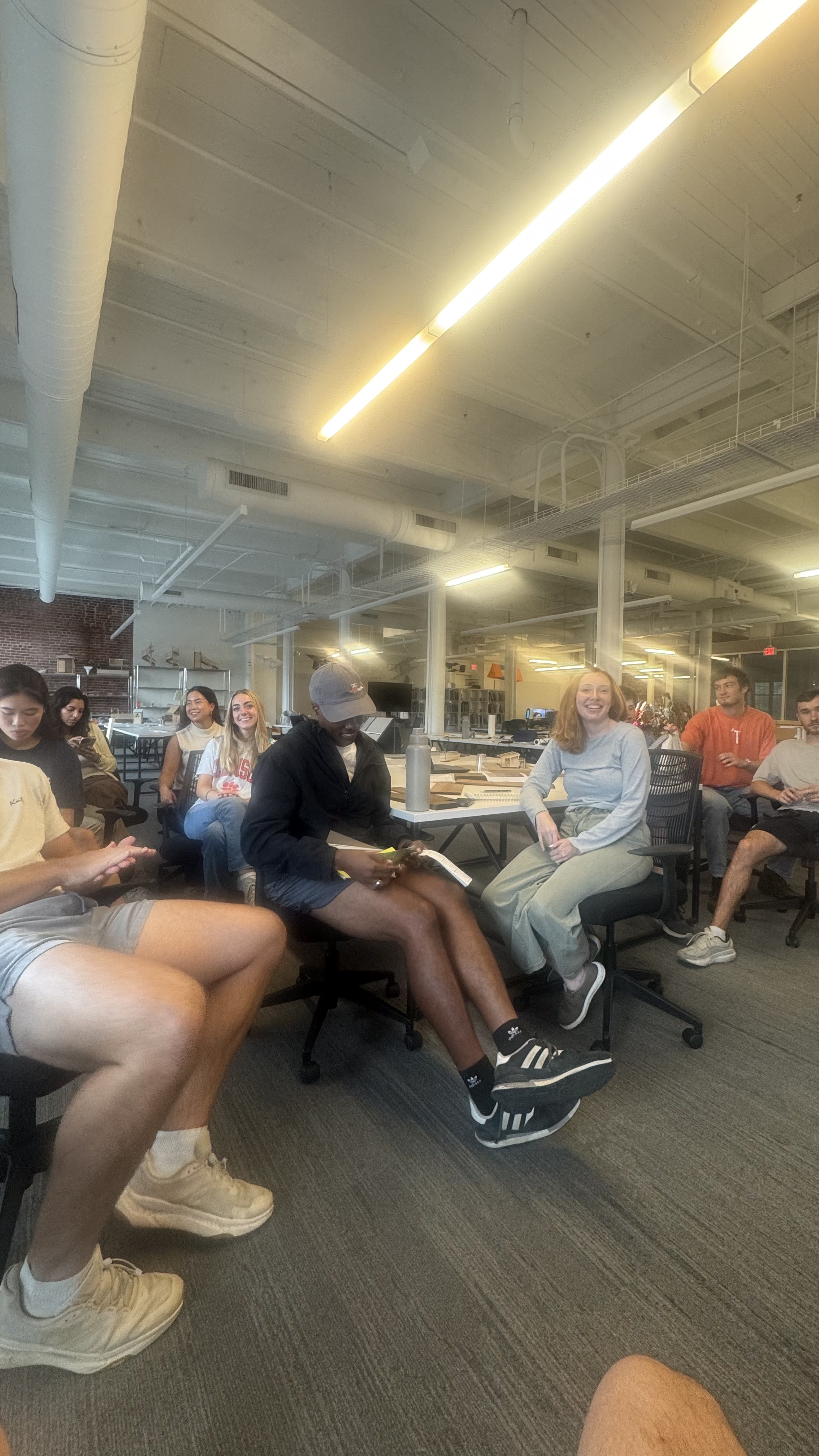
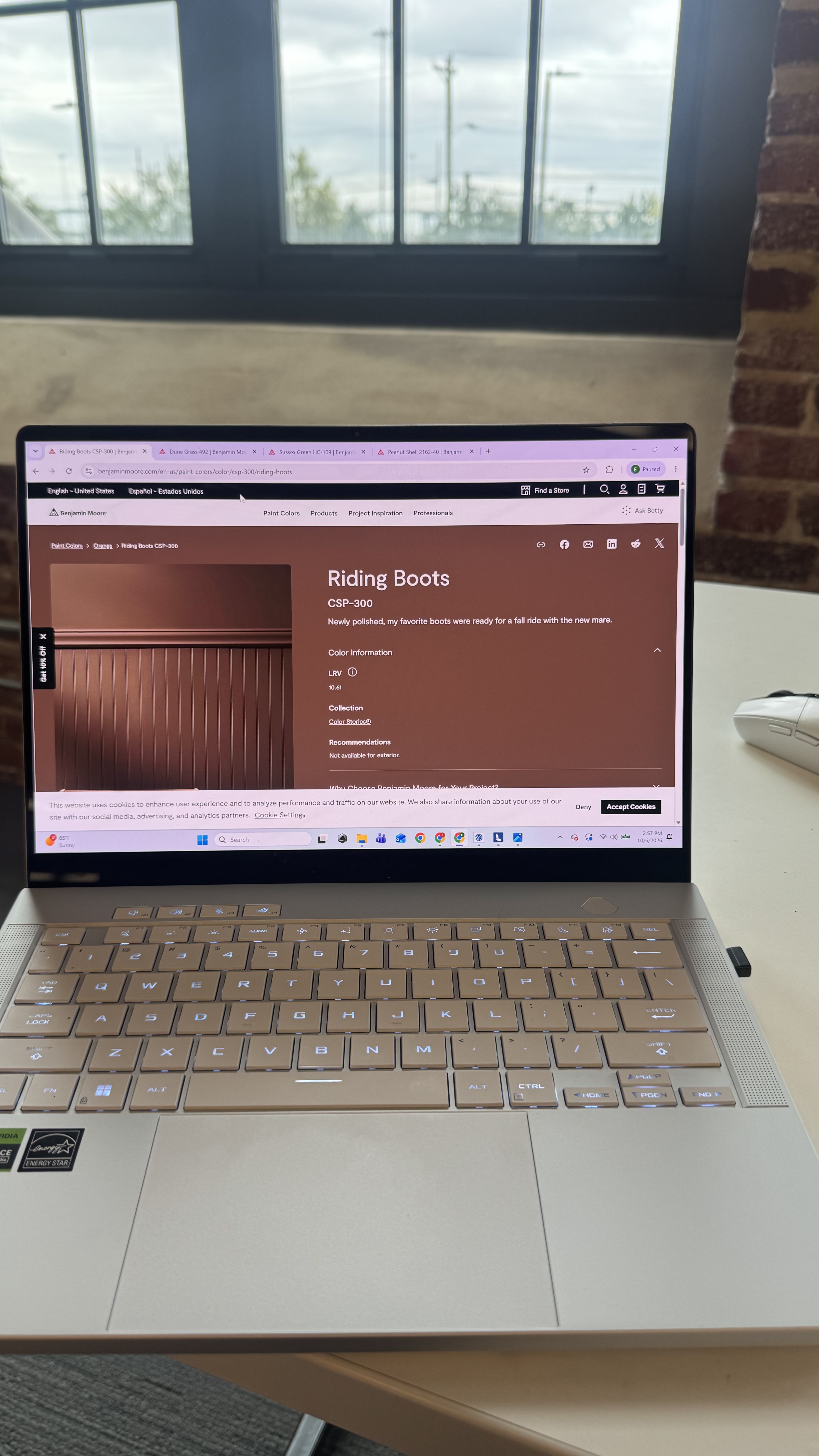
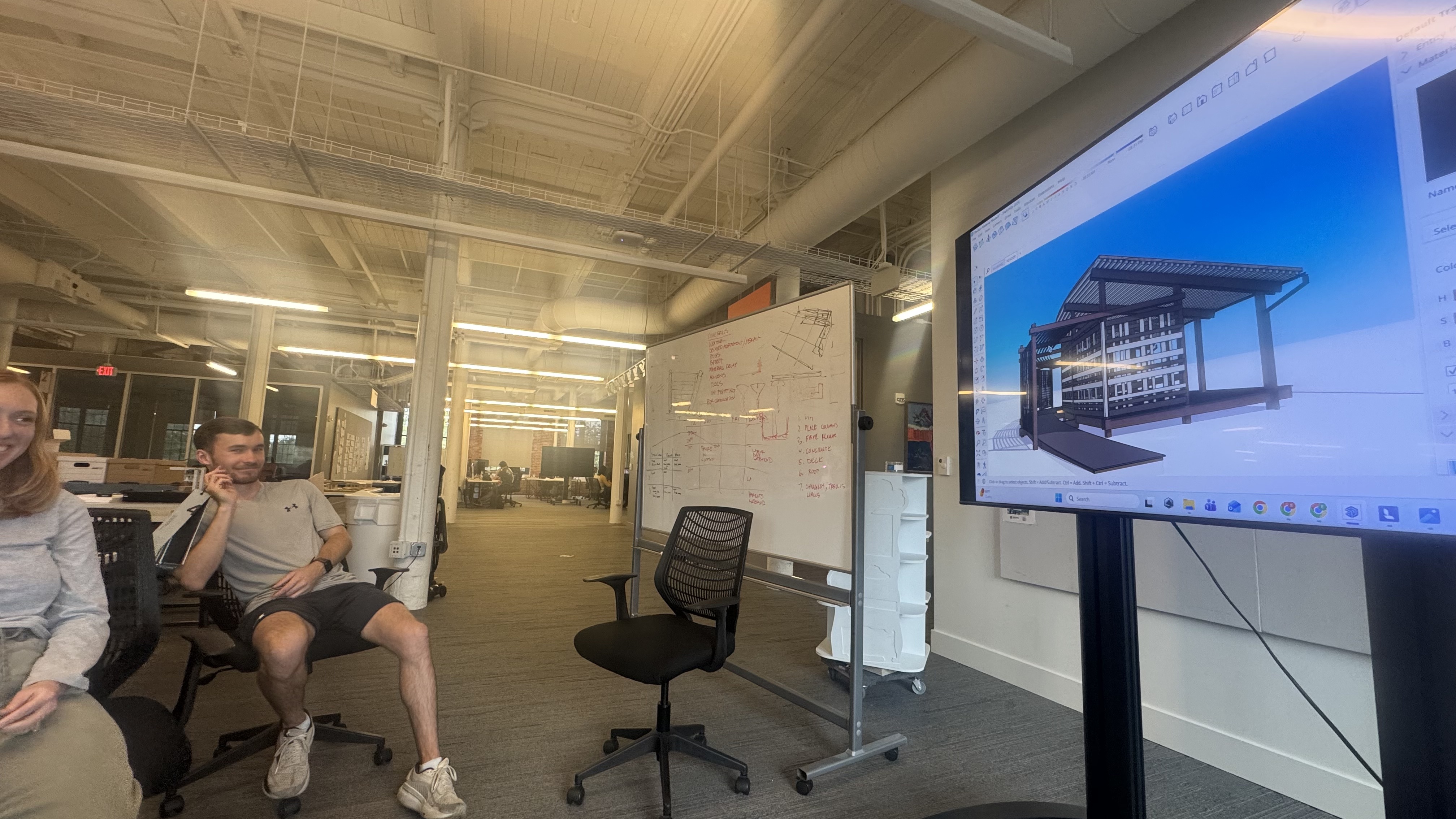
Today we worked as a studio to pick paint colors for the project. I 3D modeled the pavilion in Sketchup and also had it rendered in Lumion which helped us visualize the project. Using paint colors from Benjamin Moore, we went through a variety of colors and palettes to create a bunch of different options to look at. Right now we are liking the look of a darker brown for the main structure with a lighter green/yellow colors for the moving walls and purlins. We also rendered the Thermally Modified Pine to look “aged” as it will be a totally different color within a year. In the future, this material will gray out and not look the saturated brown it is when new. This is a factor we had to consider as well when choosing colors. Ultimately with the material new/aged, we collectively think the darker brown will provide good contrast when aged with the lighter colors giving pops of color. Our next step is to order samples to begin narrowing down the exact shade we want but in real life not on a computer screen. The colors will look much different when out in the sun/shade which is why we need to begin actually painting mock ups to determine exactly which colors to move forward with.
.